One year ago, this time I was working on a book called Mickey pe Dunăre. Written by
Alexandru Berceanu, with a cover by
Sorina Vasilescu, edited by
Jumătatea Plină, in a project produced by the
Czech Embassy in Bucharest, represented by Petra Dobruska. This book was the first in a collection of books. A collaboration between Jumatatea Plina and the Czech Embassy. The second was Aripi de oțel(Wings of Steel) by Adrian Barbu and Jiri Sitler, third was Karel Liman: Arhitect by Maria Surducan, forth Dolki-n trei straie by Ileana Surducan and Petra Dobruska. More books are to follow.
The book is about the Prague Spring in 1968, when Russia decided to invade Czechoslovakia, with troops and tanks, in order to overth
row the government for being too liberal, too democratic and too socialistic. That in itself is no problem, but in the global context of the time, this was a danger to the world order. The reason given by USSR was the infiltration of infiltrators ready to destroy the country. In any case, the Romanian Red leader at the time, was strongly opposed to the Soviet intervention and was one to refuse sending troops.
Actually the story is more detached to these events, but rather it is about a family of Czechs visiting Romania at the exact date the invasion was taking place. How does Mickey(Mouse) get on the cover of the book? I cannot answer that. Well I can, but won`t.
This is the first book I officially publish. At the beginning of 2014. Worked on it in a rush since the editors told me they need it yesterday. Looking back, I wish they would have given me more time, but the good thing, one year later(now) it`s almost sold-out, people like it, the story is nice and it was fun to work on.
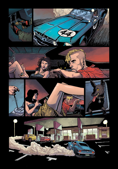
I tried drawing four pages per day since I was asked to hurry, but I would loose myself in the process and start adding details, difficult angles. Initially I wanted to draw everything in a static approach, equal panels, similar poses, but I wasn`t in that much of a rush, so now and then I would really get to enjoy setting up a page, constructing a layout I would find interesting, experiment brush strokes. At the end of the day, my main goal was to make the story as clear as possible. Help the reader understand what`s going on but also give them some understanding of the setting.
When I first read the script, I thought there should be close to two hundred pages. The kind of decompressed book, lots of large horizontal panels, that is IMO perfect for a more dramatic story. One that had limited action scenes. The end result is a 56 pages book. So I had to shrink every panel, make them mostly vertical, short so I could fit everything inside the book. This gave me a constant feeling that I`m letting things out. The printed page is close to a A5 format, so the information in each page is limited by the size of the paper. In order to enlarge certain panels I resorted to using allot of bleed panels and to vary their size depending on how much information was inside each rather than focusing on tempo. This created very interesting layouts for me, but even as I tried creating an easy flow to everything, I think the more freestyle arrangement can cause some confusion, especially in new readers of the comic book medium. I wish to apologize to those, and say that on the pages I am drawing right now, I am paying special attention to making the panel layout as clean and easy to read, as possible.
One other aspect I guess I should have payed more attention to, is lettering. It can work on a larger format, to write freehand, but as the page gets smaller, as the letters shrink, they should be drawn in a cleaner fashion. Or digitally.


